-
未登录
热门文章
justify-content 属性可以改变项目在容器中的对齐方式。
justify-content 用于设置或检索弹性盒子元素在主轴(横轴)方向上的对齐方式。
justify-content 它主要用来设置每行里面项目的排列规则,一共有 5 种设置。
justify-content: flex-start|flex-end|center|space-between|space-around|initial|inherit;
属性值
| 值 | 描述 |
|---|---|
| flex-start | 默认值。项目位于容器的开头。 |
| flex-end | 项目位于容器的结尾。 |
| center | 项目位于容器的中心。 |
| space-between | 项目位于各行之间留有空白的容器内。 |
| space-around | 项目位于各行之前、之间、之后都留有空白的容器内。 |
| initial | 设置该属性为它的默认值。请参阅 initial。 |
| inherit | 从父元素继承该属性。请参阅 inherit。 |
| IE | Edge | Firefox | Chrome | Safari | Opera | ios | android |
|---|---|---|---|---|---|---|---|
| 10+ | 12+ | 28+ | 4+ | 6.1+ | 12.1+ | 7+ | 4.4 |
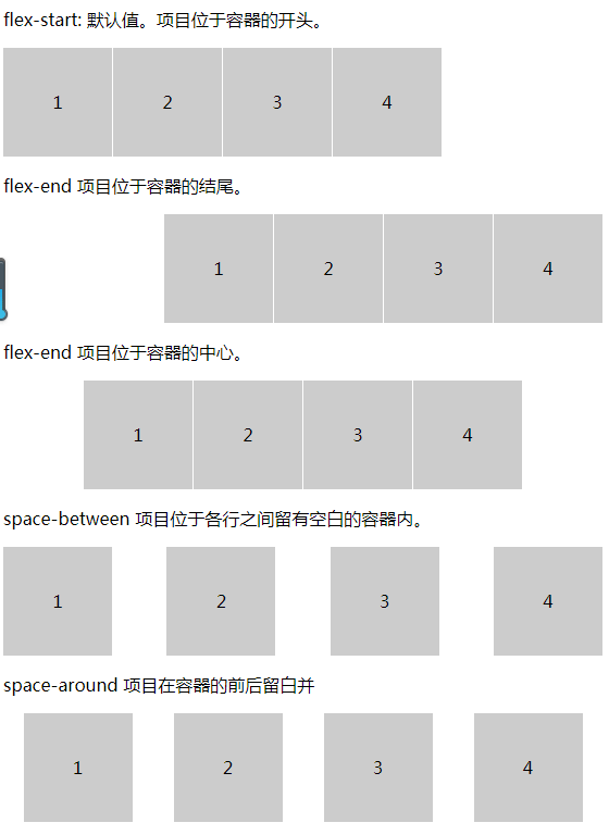
想改变对项目的对齐方式只要给 justify-content 使用不同的属性值,我们看下不同的值带来的效果。
<!DOCTYPE html>
<html lang="en">
<head>
    <meta charset="UTF-8">
    <meta name="viewport" content="width=device-width, initial-scale=1.0">
    <title>Document</title>
    <style> .demo{ display: flex; } .item{ width: 100px; height: 100px; line-height: 100px; text-align: center; background: #ccc; border-right: 1px solid #fff; } .demo-2{ justify-content: flex-end; } .demo-3{ justify-content: center; } .demo-4{ justify-content: space-between; } .demo-5{ justify-content: space-around ; } </style>
</head>
<body>
    <p>
        flex-start: 默认值。项目位于容器的开头。
    </p>
    <div class="demo demo-1">
        <div class="item">1</div>
        <div class="item">2</div>
        <div class="item">3</div>
        <div class="item">4</div>
    </div>
    <p>
        flex-end 项目位于容器的结尾。
    </p>
    <div class="demo demo-2">
        <div class="item">1</div>
        <div class="item">2</div>
        <div class="item">3</div>
        <div class="item">4</div>
    </div>
    <p>
        flex-end 项目位于容器的中心。
    </p>
    <div class="demo demo-3">
        <div class="item">1</div>
        <div class="item">2</div>
        <div class="item">3</div>
        <div class="item">4</div>
    </div>
    <p>space-between 项目位于各行之间留有空白的容器内。</p>
    <div class="demo demo-4">
        <div class="item">1</div>
        <div class="item">2</div>
        <div class="item">3</div>
        <div class="item">4</div>
    </div>
    <p>space-around 项目在容器的前后留白并</p>
    <div class="demo demo-5">
        <div class="item">1</div>
        <div class="item">2</div>
        <div class="item">3</div>
        <div class="item">4</div>
    </div>
</body>
</html>
效果图
通常我们在不知道容器宽度时候可以使用这种方式去设置我们的排版。
